How to Optimize Your Fitness Site for Sales, Not Just Visitors
Nowadays, a top item on an entrepreneur’s to-do list is building a website. It’s no secret that consumers do their research online before making a purchase decision. They search for information about fitness services and then weigh their options, comparing what you offer to what your competitors provide.
So, yes, your business needs a website.
But this is just a starting point. Too many fitness entrepreneurs fixate on the look of their site. They agonize over logo design, color choices and site layout. In short, they focus all their energy on aesthetics—without considering the only aspect of their site that truly matters: Does it sell?
Four Optimization Steps
Let’s walk through the requirements for a website that converts visitors into buyers. Use this article as a checklist, asking yourself, at each step, “Does my site do that?”
1. SHOW THEM THEY BELONG
Have you ever gone shopping for a new shirt or a pair of jeans, walked into a store and realized in a split second that it was not for you? Something about the store—the décor, the merchandising or maybe the staff—immediately told you that you were in the wrong place.
The same thing can happen when people visit your website. They make snap decisions about whether your site is or isn’t for them, and that impulse reaction will make or break your shot at a sale.
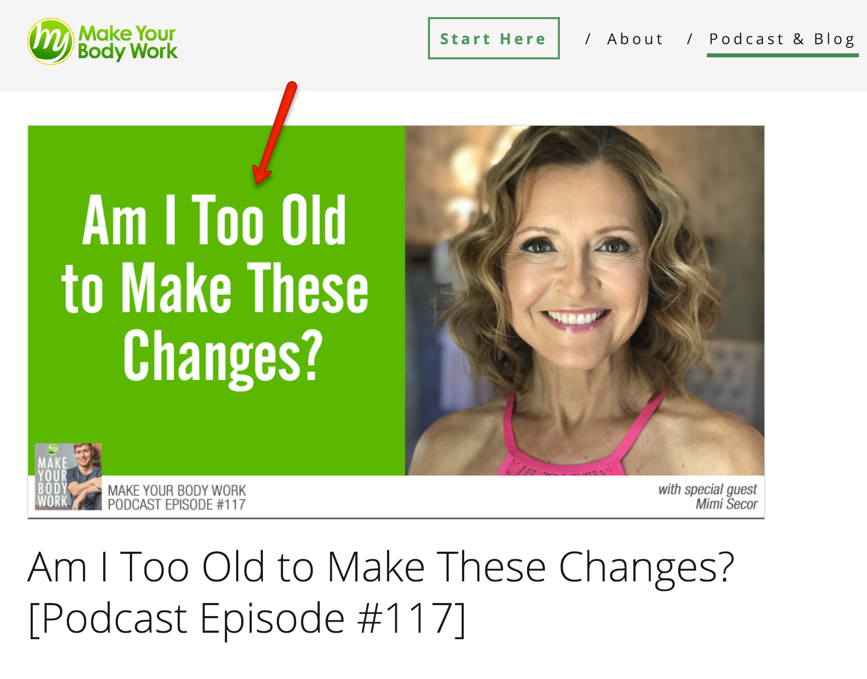
You tell visitors they belong on your site through the images you use, the headlines you write and the content you offer. For example, my website called Make Your Body Work is designed to feel like “home” for any woman in her 50s or 60s who is struggling with weight gain due to menopause. I offer blog posts and podcast episodes that cater specifically to these women.
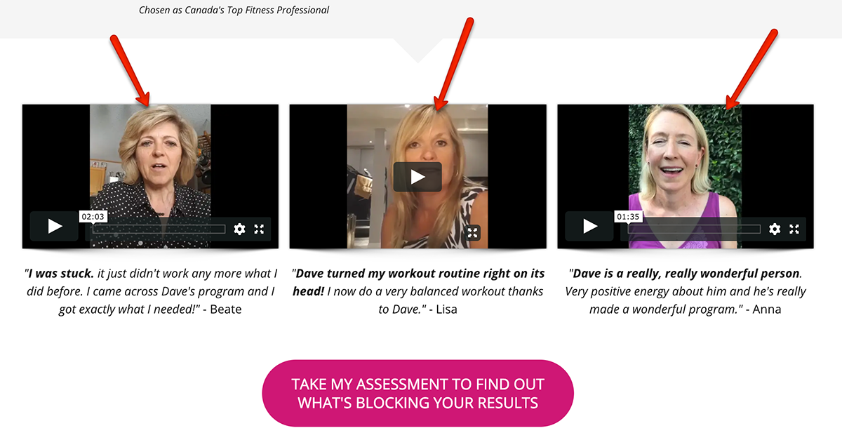
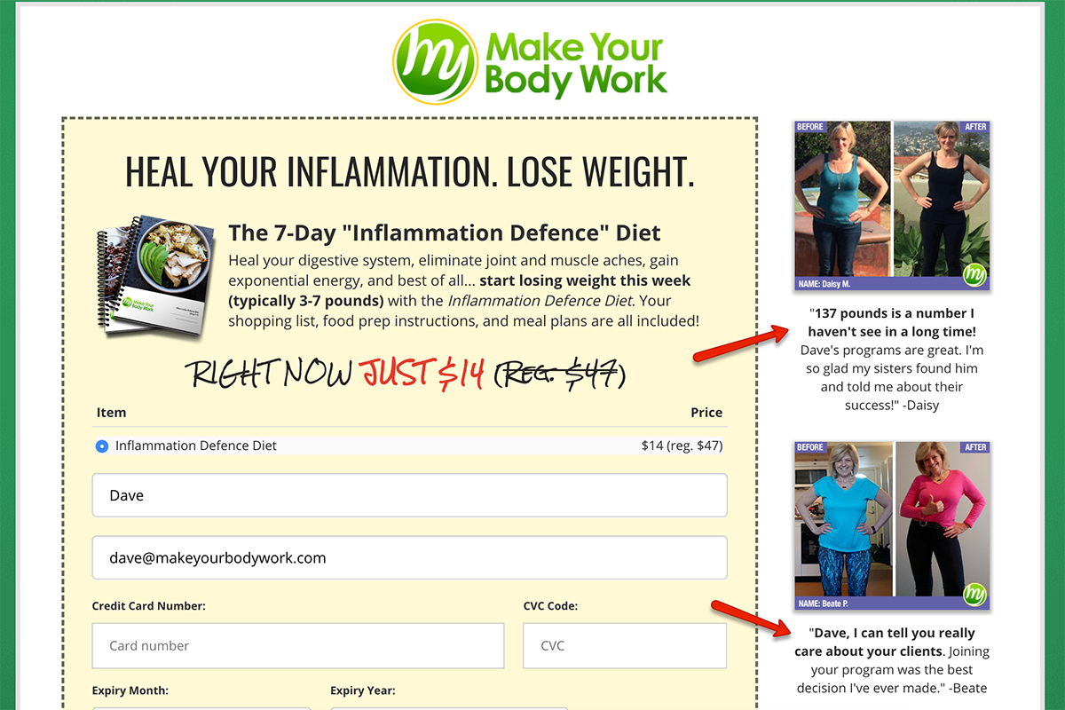
Testimonials on the site feature women in my prime demographic. I want visitors to see that their peers have used my services and achieved great results.
Your turn: Take a look at your website. Who will instantly feel “at home” when they arrive? What does your site do to make them feel safe?
2. TELL THEM WHAT TO DO
Thinking back to our retail shopping analogy, imagine going into a thrift store. There are items piled high, with little thought to organization. Sizes, colors and styles are mixed together. There could be great deals, but finding them can seem overwhelming. Your website can create similar feelings if you don’t make it clear where visitors should go and what you want those visitors to do.
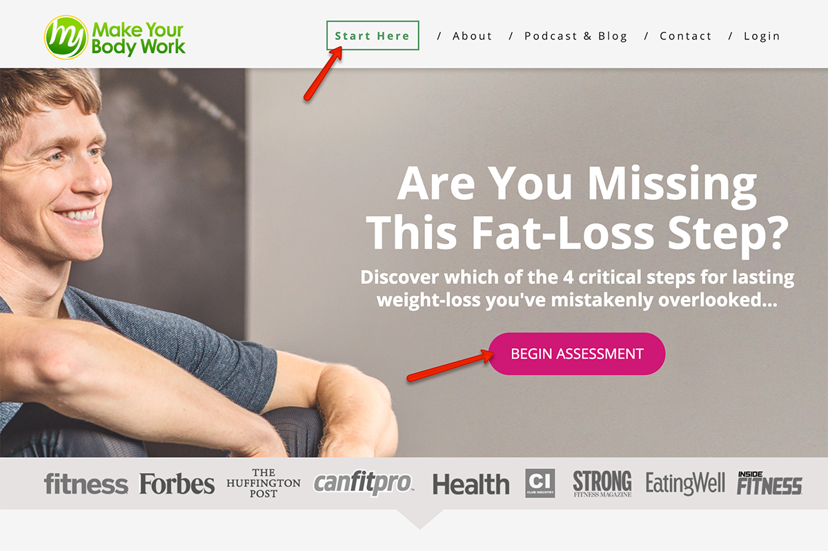
My Make Your Body Work website aims to get all visitors to take a “Fat Loss Assessment,” and I take every opportunity to guide people in that direction. On the homepage alone, there are multiple can’t-miss buttons that direct people to the assessment.
I push this assessment at every turn, because it’s the first step in my sales funnel. It encourages visitors to leave their name and email address, and it leads them to their first opportunity to buy something.
Your turn: Take a look at your homepage and make a list of all the things a visitor could choose to do. Read an article? Click a link? Fill out a form? Opt in for a free giveaway? Buy something? Contact you?
Your site should be designed to get visitors to take one specific action that moves them closer to a purchase. Your job is to eliminate nearly all other options.
3. CAST A VISION FOR THEIR FUTURE
You’ve heard the saying “Sell the sizzle, not the steak,” right? While most business owners are familiar with this adage, they neglect to follow the principle on their websites.
Too often, fitness websites attempt to sell program features:
- “Get 12 sessions for the price of 10.”
- “Use our state-of-the-art equipment.”
- “Choose from a wide variety of fitness classes.”
- “Learn from the top trainers in the city.”
Pitches like this miss the mark. They attempt to sell aspects of your products and services that prospects don’t care deeply about. They offer “the steak” without “the sizzle.” Instead, it’s crucial that your website inspire visitors by showing them where you are going to take them. You must cast a vision of where their life is headed when they begin working with you. This is called your “Big Promise.”
One product sold on my site (in Canada) is called The Inflammation Defence Diet, and the big promise is clear: It calms your internal inflammation so that your body will naturally shed 3–7 pounds without intense exercise or eating less.
The sales copy speaks to the readers’ “pain” and paints a picture of what life will be like when my product removes that pain. That’s the “sizzle” people want to buy. They want outcomes, not features.
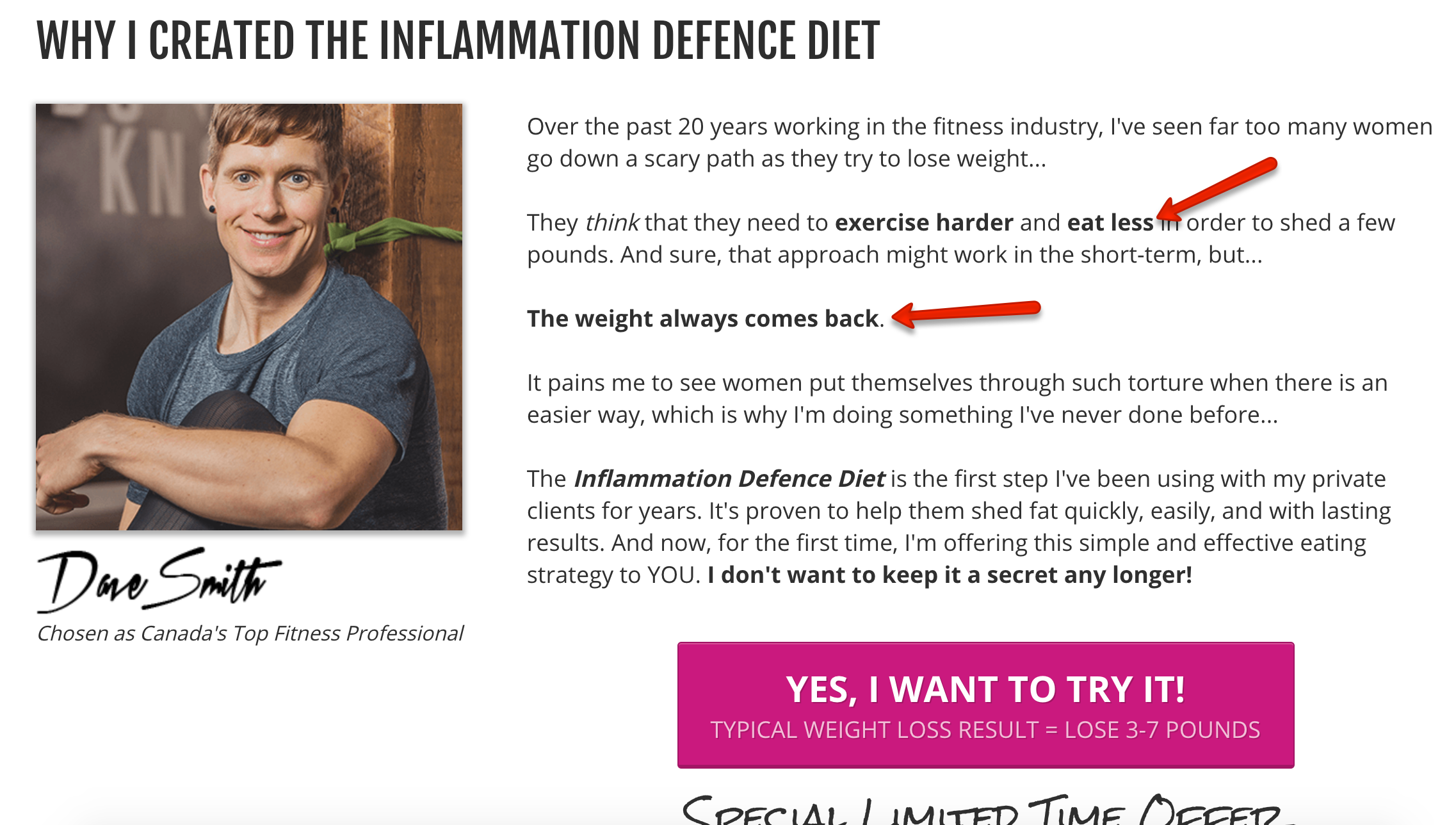
Your turn: Take a look at the offers on your website. Does your site list endless features that fail to connect emotionally with your visitors, or does it sell inspiration and hope? It might be time to update the messaging on every sales page so that your site sells a vision of a better life.
4. REDUCE THEIR FEARS
Imagine that a visitor landed on your website and felt completely “at home” from the get-go. She followed your intended path because you removed all distractions and guided her through each step. Now she’s on your sales page, feeling compelled to try your service because the outcome your product offers is just what she’s been looking for.
Despite all of this, she still may not buy from you.
There’s one more optimization step you need to take to nudge some visitors to make a purchase: You need to give them confidence that you are a trustworthy service provider.
Often, you can achieve this trustworthiness online using a tactic called “social proof,” which is simply evidence showing that other people trust you. Social proof can have a profound positive effect on your website’s sales conversion rate, and it can be easily generated in a variety of ways:
- client testimonials (ideally in video format)
- a “Like” counter showing how many followers you have on social media
- a “Recent purchaser” notification showing who bought from your website
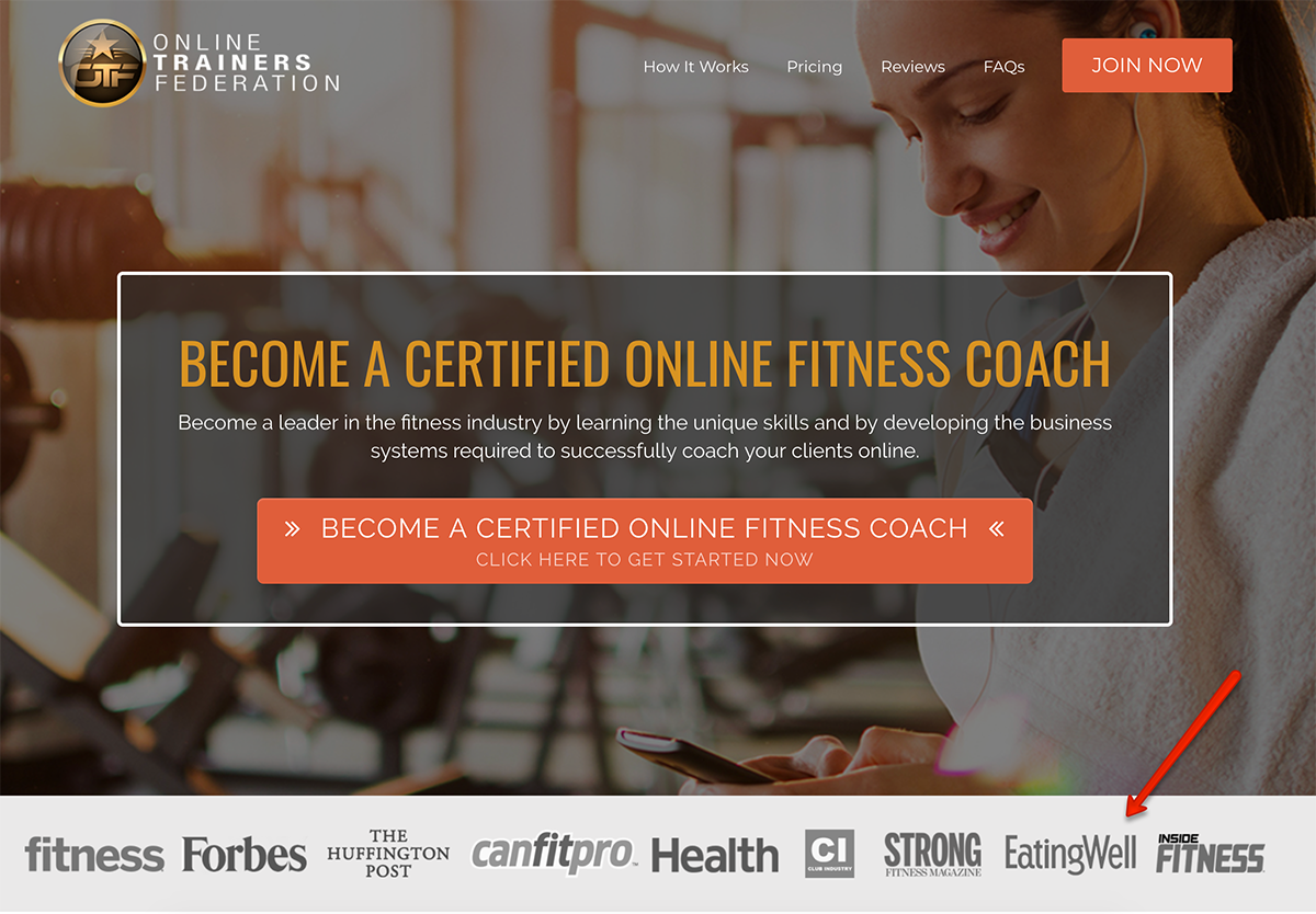
- an “As seen in” graphic displaying websites, magazines or other media outlets that have featured your business
- a list of any achievements or awards that highlight your reputable service
The sales page on my website uses testimonial images and a recent purchaser notification to assure visitors that the item they’re considering buying is trustworthy.
Another website’s sales page uses an “As seen in” graphic to boost the authority and reliability of the offer.
Finally, a sales webinar opt-in page uses a “Like” counter to prove that other visitors have found the site’s presentation valuable:
Your turn: If social proof on your sales pages doesn’t reduce visitor fear, there’s a high likelihood you’re leaving money on the table every day. Review your website. How many types of social proof are you using?
Try and Try Again
Your business is valuable only if it produces sales. Preparing your online audience to buy isn’t difficult, but your site may need a few strategic tweaks.
Don’t expect to get your site perfectly optimized on the first try. Make a few changes based on this guide, and then track the results for several weeks. Did your sales conversions increase? What else could you improve?
Continue testing one or two variables at a time to see which ones really move the needle. Testing takes time, but having a site that converts even a few percentage points better than it used to can be a game changer for your business’s bottom line.
